Friday, 31 January 2014
FINALLY FINISHED!
Goodbye.
Friday, 24 January 2014
THE END OF AN ERA
We have had some good times, some sad ones but this is the end of the road.
I'd like to thank all my Media teachers you've been fab :)
On that note Taija Clarke signing out (And Djamel's sho finger)
Progress Review
Now that the evaluation is done I'm happy however it wasn't the best experience as I'd organised myself so that I wouldn't become stressed knowing how much has to go in to the evaluation. Unfortunately I wasn't able to finish everything in class, however I had half started the other questions, only when I got home I had some technical difficulties which hasnt enabled me to use the technology I originally wanted, so I fear I may lose marks now. I am happy that I have finally caught up and is well on top of my blogs now.
Evaluation Question 3
Timetoast Timeline
http://media.timetoast.com/timelines/evaluation-question-3-70e697d5-217e-424d-a3cb-bde697035b1d
Slideshare Presentation demonstrating what and how technologies were used throughout the whole media process in a little more detail.
Evaluation Question 4 Planning
Link to vimeo - show the video
Images of ancillary products before final - to make link between feedback and final clear
Audience feedback from people to video
Audience feedback to ancillary products
Video clip of people's comments
Screen grabs from the conversation about my products
My comments towards the feedback given and mention what I have improved on - show final products
Evaluation Question 3 Planning
Technologies used for research:
- Youtube
- Twitter
- Facebook
- Internet
- Screen shots
- Videos
- Blogger
*Explain how each one was used for research
Technologies used for planning:
-YouTube
- Blogger
- Prezi
- Final cut
- Wix
- Internet
- Photoshop
- Screen shots/ videos
*Remember to mention ancillary products too
Technologies used for post production
- Canon camera
- JVC Camera
- Memory cards
- Flip cam
-IPhone
- Final cut
- Vimeo
- Photoshop
- Youtube
- Blogger
Technologies used for evaluation:
- Screen shots
- Videos
- Vimeo
- Youtube
- Blogger
- Timetoast
- Prezi
Evaluation Question 4
Who is the target audience?
Our target audience is mainly young people ranging from older teenagers to young adults. We chose this target audience as they most appeal to our genre and are the most popluar group to grab their attention with new things as well as gain support/fans and for them to be involved with our artist and products.
Our genre is pop with an urban feel. This is portrayed in our artist also by her presentation and her style.
Here is a link to our pitch to explain in further detail:
http://prezi.com/embed/ywx8qzisri8b/?bgcolor=ffffff&lock_to_path=0&autoplay=0&autohide_ctrls=0&features=undefined&disabled_features=undefined
Now I will discuss the feedback to my products.
Here is our Music Video:
Audience feedback for music video:
Kat: "Really good video. I liked the beat of the song and good use of editing techniques. there could of been more emphasis on the black petals and the heart."
Christelle: "Great cuts and editing, like the effects used throughout. I like the style of your advert and the cover of your digipak, the only thing i'd say is to have the artist facing the audience."
Bella: "There is a good colour scheme and you can see how it works well with the video."
Here is our rough cut feedback:
Ancillary Products:
Here are screenshots of the conversation I had with Katrina about my ancillary products:
I was pleased that she liked my ancillary products but also that she had constructive feedback to give so I know what to improve on.
My repsonse to the feedback:
With all of these comments i took on board the points to make clearer links, so i made sure the most obvious aspects were seen throughout all 3 products. i done this by the colour scheme; black and white - having that theme throughout and the text/font as well as the graphics of the black rose. The biggest one was the location, including millennium bridge in all 3 of my products.
I also changed the original image on the front cover to have the artist facing the audience.
I feel that audience feedback has really helped as the majority of people were of similar ages and relevant to our target audience, therefore that makes the feedback even more benefecial as you find out about what your target audience likes as well. By asking teachers and older people you see thier view as a professional and if they think it ties in with todays music. It generally looks good and you can see how successful these products could be. it gives you a good insight as to what really goes on behind the singing and posters, how much work it is and what the outcome is.
Evaluation question 2 Planning
How synergy was used?
- BLACK rose - Adara BLACK
- Location - millennium bridge - advert and digipak inside
- black and white - theme for all products/artists dress
- black rose petals/heart - in video, on advert and on digipak
*Videos illustrating good use of synergy ; Ed Sheeran/Jessie J/ Rizzle Kicks
audience can see through colour and products - there is a clear link
costume on the artist in products (all 3)
seeing he location clearly and the bridge is always the main subject
the products are successful together, you can see the link and sense of style
the audience will be attracted to them. aimed at out target audience - research was carried out on this and their style.
Thursday, 23 January 2014
Wednesday, 22 January 2014
Evaluation Question 1
In what ways does your media product use, develop or challenge forms and conventions of real media products?
Evaluation Question 2
How effective is the combination of your main product (video) and ancillary texts ( digipak and advertisement)?
29. Aliyah, Djamel, Kevin, Taija from 283goswell on Vimeo.
Evaluation Question 3
How did you use media technologies in the construction and research, planning and evaluation stages?
The making of Evaluation question 2
The making of Evaluation question 3
Powtoon animation
iMovie
Social Media
Wix
Photoshop
Blogger
Lino
Soundcloud/ Podcast
Slideshare
Photobucket
Online post it note
Prezi
Timetoast
Embedded MP3
Glogster
Internet - Youtube
Vlogs
Embedded images
Embedded Videos
Garage Band
Gifs
Tuesday, 21 January 2014
EVALUATION QUESTION 3

Further more I used vimeo, another video sharing website, to view multiple students work to see how they worked and how i can better myself and my group. This gave me some idea s as to what to do and what not to do and proved helpful when choosing locations (being careful not to choose locations which have been already used several times)
EVALUATIONS QUESTION 2
Links between Media products are very essential. Artist tend to do little things like add visual links between the Tv adverts, album covers and music videos. For example, in Ed Sheeran - Drunk we see he has a cat as a prop. This links in with his album cover in the corner he includes a cats paw. Little links like this are used to increase appeal and sales.
Evaluation Question 1
The three media products are:
- Music Video
- Digipak
- Advertisement
Music Video:
What are the forms and conventions of music videos?
The main conventions of a music video I have found are:
- The use of colour; there is a theme between the artist and the video.
- There also tends to be an atmosphere created depending on the style of the artist.
- The songs are usually upbeat and/or have a particular beat to it - again this is dependant on the style/theme of the artist.
- Music videos will also have a storyline and a set of characters. It is common for the artist to represent one of the characters.
This is based on the research I have done previously and these are aspects which came up quite frequently.
Here are a few of the videos I analysed which I think illustrate this well.
Katy Perry - Teenage Dream
There is a lively atmosphere and the story and video link very well together. Her costume also matches the style of the video. And there is a traditional story, her being apart of it.
Bruno Mars - Lazy Song
The name of this song links with the video clearly and the style of the song matches the style of the artist. The storyline of this son and how it is done, the use of dance also makes the video fun.
Jessie J - Price Tag
This song is quite upbeat and creates a happy atmosphere, colourful. The lyrics go with the video and she illustrates this herself. The style of this video is what appeals to me most.
There are three theorists who have different views on music videos but they all relate to our music video as we have taken aspects from each to create a better product.
Andrew Goodwin:
Goodwin talks about music videos being for the audience.They provide a visual pleasure and they aim to appeal to a wider audience other than the core audience.
He says that pop videos rely on three things; intertextuality, advertisement and repetition of images.
Goodwin also distinguishes three types of music video:
- Illustration; whereby the video illustrates a clear storyline and you can see a direct link.
- Amplification; Where there is a clear link between the video and the storyline however there are also hidden meanings.
- Disjuncture; Whereby the lyrics/storyline and the video do not convey a clear link.
Carol Vernallis:
Vernallis discusses camera work and edits in music videos and says that music videos have a rhythmic basis closely linked to the song and edits in a music video are more frequent She identifies that jump cuts are used a lot and a base track is vital.
Laura Mulvey:
Mulvey discusses female representation. How they are represented and what their purpose is in videos. The kinds of videos that you see women in and how in todays society there are certain genres to an extent that challlenge her theory.
Here is her quote in my own words:
"In a world structured by gender inequality, male and female admiration has been distinguished differently. The female figure is displayed in various ways for the male audience to admire and make believe their fantasies."
With regards to all three of these theories, the most helpful has been Goodwin, as he discusses the main points of music videos ands the basis of them. His theory is very beneficial in terms of what he says about the three types of music video as our music video is of the illustration category.
Mulvey was helpful in a way that our artist is a female, so we had to think about how to portray her and make her appealing to a wider target audience, was using Mulveys theory a way to do this? We thought not, however we used a few elements suck as dismemberment and short shots of the artist.
Vernallis I'd say was another very helpful theorist as she discusses the technical aspects of a music video and in our music video we done a lot of editing and used a few effects to make it more appealing and relate to our target audience.
Here a few videos that have inspired me along the way, however that are related to the theorists, in particular Goodwin as our music video is of illustration.
Christina Aguilera - Beautiful
This video I feel shows the illustration of a music video very well. There is a clear link between the video and the lyrics. The storyline of this song is what is most touching about the video.
Robin Thicke - Blurred Lines
This video illustrates the dismemberment aspect Mulvey talks about and shows the majority of the terms she discusses. I like it because of the way it is set out and use of colour.
Kanye West - All of The Lights
This video is a good example of how much editing was used, it looks bright and uses a lot of jump cuts to give the video more emphasis. The style of this video is what is most appealing.
Here is our music video and a few screenshots that illustrate some of the points I have discussed and relate to the conventions.
With respect to use of conventions, we have done that, using the majority of them to make our video as successful as we can. We challenged conventions in terms of style, creativity. Making our artist different and stand out, however we also developed the conventions to make our video better as many artists from oir genre tend to do similar thongs and we wanted it to stand out.
29. Aliyah, Djamel, Kevin, Taija from 283goswell on Vimeo.
Ancillary Products Digipak/Advertisement:
What are the forms and conventions of adverts and digipaks?
- Digipaks usually have 4,6 or 8 panels
- Digipaks often contain information about the artist to promote the artist.
- Ancillary products are used to promote the artist further
- They inform fans of their work and upcoming dates
- Advertisements can come in various sizes and shapes
- Advertisements are used in multiple places; as billboards outside, on buses, trains, posters outside, along with the album
- a clear link between the products using fonts, colours, style, image and graphics.
I have used the majority of these conventions and forms. As well as some of them being compulsory, it shows when you look at examples how it works out for other successful artist. The only thing down to me was the style and creativity put in to it.
Here are a few examples of the digipaks that I found inspiring and go along with the guidelines of what i have just discussed:
Rizzle Kicks:
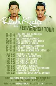
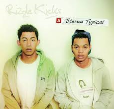
Their album front and back cover as well as their advert I think is a good example of the way it is linked and you can easily distinguish the style and theme of the group because of their choice of text, font, image and colour scheme. It also looks really simple but fun at the same time and these are two aspects i wanted to bring in to my products. To get the style of the artist across clearly but still have all three products link, so you know who they are from.


Adele:
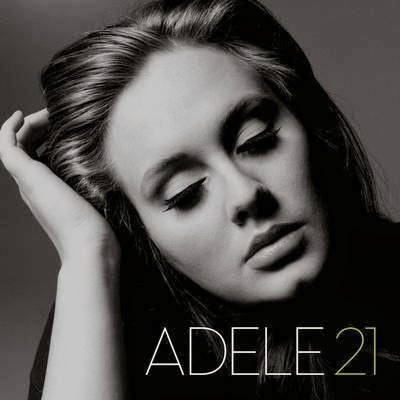
Adele is another artist who likes simplicity. I believe that simplicity works very well and she illustrated this. Her choice of colour, font and image again links all of her products together and with the style of her songs, you can see where she got these ideas from. Her songs tend to be more deeper and meaningful, so choosing sinful colours put this across clearer. I chose her album cover because of the way she follows many of the conventions.


Here are screenshots of my digipak and advertisement which illustrate the conventions of digipaks and adverts. You can see links between the products; the use of the black rose, the location millennium bridge and our colour scheme - black and white.


